Presentations
The following are summaries of the presentations based on meeting notes, recordings, and edits of presenters.
Web Apps - The Next Generation: Access Opportunity or Challenge
Presenter
TV Raman, Google
Summary
In this presentation, T.V. Raman asserts that new technologies should be seen as new opportunities, rather than as obstacles and complications. Through coordinated development of content, the user interface, and assistive technology, the reach of people using assistive technology can be increased. Newer light-weight components even make it possible to quickly create custom interfaces, delivering useful information in a wide range of contexts and usable by a variety of technologies.
Presentation
Hosted Web applications offer the promise of easy deployment, light-weight user interaction, ubiquitous access to data, and easy upgrades, but a shift in approach will be needed before they work with assistive technologies (AT). To an extent, the blind community has put itself in a bind by saying something is accessible if it works with a screen reader. A better approach is to view accessibility as usability done properly, with graceful degradation for less capable technologies.
Access goals with Web applications are to:
- Retain at least the present level of access to functionality for people using AT
- Increase the reach of people using AT by enabling a wider range of forms of access
- Enable access in more user contexts
- Enable people with disabilities to use any machine with access to the network, not just the machine with their AT on it.
The building blocks of access are the following:
- Content: Content includes adequate semantics
- User Interface (UI): The UI degrades gracefully for less capable technologies.
- Assistive Technology (AT): AT is designed to bridge the gap between the Web application and the user.
To build speech access, we need to be able to identify what to speak, determine how to speak it, and decide when to speak.
- What to speak can be addressed by rich markup of Web content so that every chunk of text has a role. Separating content from presentation helps to better management content and to structure content to reflect its role.
- How to speak can be controlled through aural styles.
- When to speak can be addressed with event handlers, which will hear the event and respond accordingly.
The Web application model provides an opportunity for AT to extend and embrace the Web model.
- Data resides on the network.
- Interaction resides in the client.
- HTTP operations can be done any time to synchronize data.
- Browser widgets create the user interface (UI).
- Applications, instead of being single monolithic programs on the local computer, can be chopped into pieces, some on the servers, some on the client.
- AT dynamics are no different from mainstream Web technologies.
The Web browser becomes a container for the Web application, functioning as a universal client.
- The UI is realized through Web pages.
- HTML for creating content.
- CSS for styling.
- DOM eventing for adding behavior
- Exposes client-side interaction logic.
Custom interfaces are doable in the Web world, providing new opportunities for access.
- Interfaces no longer need to be "one size fits all."
- User interactions can be optimized to user's needs.
- Multiple UIs can collaborate.
- APIs made available by services like Google can be used to place the service in a wide range of contexts.
New adaptive technologies can be built from the growing arsenal of light-weight components.
- A new market is appearing for consumer applications.
- Custom services can be tailored to end-user needs.
- Task-driven access tools can be built.
- The new AT will be so light-weight and simple it can be quickly built and easily changed.
Separation of content from interaction is laying the foundation for mashups. What is the accessible equivalent of a mashup?
- Light-weight Web APIs.
- Atom/RSS based syndication
- AJAX APIs for hosting services (Google Maps, Google Calendars)
- Syndication of data sources to customer UI
Inspiration for innovative AT could come from audio games. Games often lead to UI innovation.
In conclusion, it is important to build on what we have, but thinking only in terms of current AT is too limiting.
Assistive Technology Vendor Panel
Panelists
TV Raman, Google; Doug Geoffray, GW Micro
Summary
Early AT software simply captured text, but as pages and interfaces became more complex, accessibility aids such as Microsoft Active Accessibility were needed. Now, with the appearance of dynamic HTML content, new approaches must be developed. IBM is working with W3C, FireFox, and others to address this need. A key challenge is the lack of coordination among AT developers.
Presentations
Doug Geoffray
With early AT software, content could be read by capturing the text output, but as pages became more complex, that approach could yield gibberish. Microsoft Active Accessibility (MSAA) gave AT a way to get at content within, but still pages could have much more complexity that was indicated by MSAA. GW Micro's Window-Eyes screen reading software is designed to use MSAA and the Windows Document Object Model (DOM) to move through content, but is still basically designed for reading static pages. Users can move back and forth between a virtual mode, which navigates a copy of the page, and a browse mode which interacts directly with the page, such as when doing forms. GW Micro is working with IBM to find ways to handle dynamic HTML elements.
As Web applications move into the browser, one challenge is that virtual mode is becoming useless because it does not know about dynamic changes in page content between page loads. A standard method is needed for AT to communicate with the Web applications. How can menu items be presented to the blind user? How can Web applications have the consistency of method AT needs when there are so many different authors and applets?
TV Raman
Early text browsers, such as Emacspeak, demonstrated the advantages of formatting text in terms of its type (from, to, subject). How can we bring the content out of the prison of the screen reader? Why can't the user community build its own set of tools using tools such as GreaseMonkey scripts?
Among assistive technologies, a key problem is that there are too many control key combinations. Every possible combination has been taken and getting AT software developers to coordinate is very difficult. Also, people writing self-voicing applications do not necessarily know what people who are blind need. Not every blind person wants audio. Some just want Braille. Other problems are that the infrastructure in Windows is inconsistent and there are a huge number of APIs AT must be designed to deal with. The result of this confusion is that innovation with respect to the blind has come to a standstill.
Publishing and sharing knowledge about these challenges is the way to get things moving. IBM has focused on open standards:
- Took design issues to the World Wide Web Consortium (W3C).
- Worked with FireFox, including donating code.
- Worked with Linux.
- Avoiding working with any one company.
With the growth of cell phones and MP3 players, are we seeing a shift to aural delivery? Not necessarily. Quality is the key. What a blind user needs to hear is different from what a sighted person needs. You need to have a fairly high threshold of pain to deal with current voice software. The general user has a lower pain threshold and expects higher sound quality. An interesting aspect of the aural delivery idea is how the interaction and aural content might be managed to produce a distinct sound and feel, such as of a Nike shoes commercial site.
W3C Roadmap for Accessible Rich Internet Applications
Summary
The wide variety of ways data in pages are organized is a major obstacle in writing AT for rich Internet applications. A standard interoperativity contract between the Web application and AT is needed. The Roadmap for Accessible Rich Internet Applications identifies gaps that need to be filled. A review and update of guidelines, standards, and laws relating to accessibility will be needed as these new methods are developed and implemented.
Presentation
We are moving from the static document into the rich desktop experience. The Roadmap for Accessible Rich Internet Applications (ARIA) is a gap analysis aimed at providing plans and guidelines we can use to addressing the holes.
Accessibility of a graphical user interface (GUI) is about getting to the data, but everyone's data is organized differently. We need an accessibility application programming interface (API) that defines a standard contract between the Web application and the assistive technology which should include the following:
- role
- state
- actions
- caret
- selection
- text
- hypertext
- value
- name
- description
Keyboard accessibility is an example of the problems we face:
- In current XHTML, only anchors and form fields accept focus.
- We need better ways to manage tabbing.
- Pop-ups are often not keyboard accessible.
- It is hard to know what a link is for.
- Navigating to items within a page often requires navigating through the entire page.
- AT companies like GW Micro have to guess what contract elements are being used and how they are defined.
Work is underway to develop new standards for XHTML:
- Extending XHTML through namespaces to define new states and properties.
- Checked, expandable, selected, does this object control another object
- Tabindex property that can apply to all elements in a document
- Typical widget states
- Relationships (describedby, controls, flowto)
- AJAX properties ( live, relevant, atomic)
- Provide a role attribute in the XHTML namespace for identifying roles of elements.
- An ARIA role model including common landmarks (navigation, search, main, secondary, note, see also)
The goal is to provide information to map the content to the accessibility API, even as the content changes. As we see more distributed development of mashups, these standards could be built into the tools used to build them. The Dojo AJAX library is already including many of these ideas.
Part of the effort is to clarify best methods, such as in menus utilizing tabs only for the highest level and using arrow keys within the menu tree.
We need to address legislation relating to accessibility. Most of the legislation (WCAG1, 508) is based on 1998 browser technology and is rapidly becoming an obstacle to finding solutions. We need to focus on interoperability and usability, rather than try to exclude technologies. The IMS Global Learning Consortium accessibility specifications are an example of what could done.
Resources on this topic include the following:
- W3C Protocols and Formats Working Group - ARIA Roadmap
- University of Illinois Accessibility Extensions
- WAI Role Taxonomy Extension Tool
Management Panel: Policies, Practices, and Processes for Maintaining Accessibility
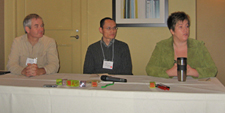
Panelists
- Bill Corrigan, Director, Distance Learning Design, University of Washington Educational Outreach
- Cheryl Hammond, Senior Applications Systems Engineer, Administrative Information Systems (AIS) Development, University of Washington
- Wei-zhong Wang, Senior Information Processing Consultant, Division of Information Technology, University of Wisconsin-Madison
Summary
Recognizing the importance of accessibility in online education, process and procedures addressing it were built into course design, quality assurance, and instructor training. Instructors want to use more rich media. Evaluating sites is challenging as content is built with more technologies. Developers, excited about new technologies such as AJAX, can easily forget about accessibility.
Presentations
Bill Corrigan
When developing independent study programs, the question of accessibility came up. If someone identified a specific problem we would fix it. Then Sheryl Burgstahler gave us a presentation on accessibility, making it clear it was a lot easier to build Web sites that are accessible from the start, rather than go back and retrofit sites. As a result, Educational Outreach set up processes and procedures including improved Web skills, incorporating checking for accessibility features into the Quality Assurance process, and incorporating accessibility into the design process so that everyone would be talking about it, including the instructors.
A system of indicators was developed for evaluating distance learning education sites.
- The site should communicate about accessibility, stating the intention to make it accessible.
- Accessibility is worked into the checklist for developing courses to ensure that everyone knows that accessibility is a goal of the department.
- Accessibility is addressed in the guidelines to instructors, stating the accessibility is a priority.
- Making HTML pages accessible is the easiest.
- Course developers are moving toward using less HTML and more rich media like Flash. Instructors are creating content themselves using tools they are familiar with.
- Everyone involved is trying to reduce the time it takes to produce material.
Wei-zhong Wang
University of Wisconsin-Madison, which has a resource center for students with special needs, has had a Web accessibility policy since 2001.
- A Web doctor evaluates Web sites before they are finalized. Common situations are database driven pages with tables layouts, missing labels in electronic forms, frames and iframes with no labels, and complex Javascript. Many sites do not meet campus policy but work with screen readers.
- Every application must be accessible
- Accessibility testing is required.
- Working to move it to the top of the list of checkpoints.
- Language about accessibility is being added to the software procurement process and documents.
- Updates and upgrades can be a problem. The original design may be accessible, but updates add complexity that may break accessibility.
- It is hard to ensure accessibility of imported content.
- Streaming media service has been offered for several years, but explaining how to make 508 compliant videos can be a problem. The current system uses MagPie to do captioning and can be time-consuming.
- Podcasting use in teaching and learning is growing. To get grant money, a plan on how you will make your content accessible is required. Services are provided on and off campus to do captioning.
- eTeach, a rich media authoring environment, is being used to do online courses. In eTeach, slides and TOC links automatically synchronize. Control buttons work with Home Page Reader and JAWS.
- Library electronic resources include a large number of PDF files, both images and text readable. A quick scanning service makes possible timely availability. If requests for better accessibility to a file are received, the instructor deals with it.
- Wisconsin Historical Society has joined the Google Book Project, but so far it is not very accessible. Meetings are underway with the University of Wisconsin-Madison, the National Federation for the Blind, the Daisy Consortium, and others on the topic.
- Spam getting in through Web forms has been a problem. Some sites are using a simple "add two integers" task to test whether a page visitor is a person or a robot. So far no robots have gotten through the task.
- Page authors are encouraged to ensure screen shots and images are enhancements and that the text makes complete sense by itself.
- Database driven content is being done in ways that allow multiple modes of output for different access devices.
Cheryl Hammond
As a lead technical analyst for electronic research administration systems at the University of Washington, Cheryl has become passionate about accessibility.
Developers, enthusiastic about trying new technologies like AJAX, are frequently an obstacle to accessible design. Developers want to provide more interactive interfaces and quicker response time. What roadblocks are in the way between us and using new technologies?
Developers who work on internal and faculty applications can develop a false sense of security of only dealing with a limited audience. As we make ourselves more dependent on electronic technology, we are going to need to insure that our technology works for everyone now and for any people we may hire in the future.
Discussion
How can you evaluate accessibility?
- At UW-M, evaluation is based on the 508 standard. Initially, online tools were used, although most applications are behind an authentication mechanism. Pages are also manually checked, tested by persons with disabilities, and the page code examined. If possible, the developer shadows the tester during the tests.
- At UW Educational Outreach, evaluation tools are used but are not relied on exclusively. It is necessary to go through the pages conducting tests, such as of tab keys. When new designs are developed, time is scheduled at the Adaptive Technology Lab to test them on AT software. Videos are difficult. Efforts are being made to build captioning into the budget when getting grants for videos. Requiring a script be created before doing voiceover provides that can then be offered as alternative text.
When there are legal requirements, it is worth doing more work to fully understand why the requirements are the way they are. When federal money is involved, you should be 508 compliant.
How accessible is AJAX? .Net developers will be using Microsoft libraries, including ATLAS. Open source libraries are way ahead in terms of accessibility. The Dojo Toolkit is available and includes many accessibility features. Saying technology is not available is a punt.
Accessibility of Rich Adobe Applications
Presenter
Bob Regan, Adobe
Summary
Current accessibility standards tend to push us toward text oriented content, but for many people, interactivity addresses how they learn. In rich media, label, role, state, and structure need to be provided for for good interaction between AT and content. Evaluating usability of rich media presents some puzzles, including control the time axis and notifying the user of content changes.
Presentation
The techniques for making rich Adobe applications accessible are easy. The hard part is getting developers to use the techniques.
In Web applications, single screen updates, diverse controls (buttons, sliders), and live data updates (constantly streaming data to the browser) can be difficult for someone using AT to follow.
When developing Web applications with technologies like AJAX and Flash (including Flex, a structured language for creating Flash content), we have a number of standards we can work with.
- The World Wide Web Consortium (W3C) Web Content Accessibility Guidelines (WCAG) are getting old and tend to push us toward approaches like graceful degradation.
- Interoperability standards from several sources. These are all in motion:
- Microsoft Active Accessibility (renamed UI Automation in Vista)
- DOM-based mapping to MSAA
- ATK-Linux
- MacAccessibility API
We be able to evaluate designs, we need a base set of assistive technology to test against. The disabled are not the only community we have to address, but designs must work for the blind community - that is a baseline requirement. Needs of the blind can be addressed with both audio and tactile interfaces.
Usability is an important question. A design feature can work in AT, but will anyone use it? Associating usability and accessibility is tricky. One site with 37 frames, each fed by a different data stream, followed standards, but will it make sense and be meaningful to the user?
One approach to accessible design is disability use cases:
- A person who is blind.
- A person with a mobility impairment (someone who can use the mouse but who has trouble with small targets).
- A person with low vision (requires a screen magnifier).
- A person who is color blind.
- A person who is deaf (need captioning for audio and video).
- A person with a cognitive disability. This may be the largest and most complicated group and we have no checklist on how to address cognitive disabilities.
Needs can be conflicting. For someone who is blind, the most accessible form of content is text. For a person with a cognitive disability, the least accessible form of content may be text.
If we prohibit interactive media such as Flash, we will be leaving a large group of people behind. Interactivity addresses how many of us learn.
Training developers about accessibility is challenging:
- Many developers have been groomed to think visually. When asked to step outside the visual approach, they are lost.
- Ask developers to use a screen reader an hour a day. Leave the monitor on so they can track what the voice browser is reading. Most people take about six weeks to develop an intuition of what is usable and accessible.
- Include people with disabilities in the process of designing and evaluating designs. Be sure to budget money to pay them. You cannot just exploit the blind to make your applications better.
Successful development of accessible Web applications must address four characteristics of elements and objects:
- Label: What is this thing? The label differentiates repeated instances of the same control. Every control should have an associated label. Labeling puts the user in charge.
- Role: What does this thing do? The screen reader user should know what every control does, including correct identification of buttons, and identification of controls emulating standard Windows controls. Unusual controls should provide cues to users as to their identification, operation, and state.
- For a standard set of roles to work, you need many developers to use them. Developers often do not want to stick to standards, but without the standards there is no way to make a predictable experience for AT. Managers need to tell developers to stick to the provided options. The Roadmap now defines 43 roles.
- As roles become standard and common, we want to include them and figure how they will work for AT.
- State: Is this thing on or off? Managing state is easier in more structured languages, such as in Flex. Flash can manipulate the time axis, which presents some interesting problems dealing with information changing over time.
- Structure: How are things connected? How do things relate to one another? With RIAs, often changing something in one part of the application can changes in another part of the application.
Rich applications present some puzzles:
- Managing a list: A list can be visually presented with Flash as a series of graphical objects and the means made available to manipulate the objects, but how much information should be made available to the screen reader? WCAG2 is weak on the notion of the relationship between controls. The responsibility for saying what has changed belongs to the object that has been changed - it is the only one that knows of the change.
- Screen updates: How do you let someone know a change has occurred on the screen? Does the user want to be interrupted and notified of an event even when doing something else?
- Time access: A blind user will want to be able to take control of the time axis, such as by tabbing to the next time increment. When you are interacting with video or audio, such as in a game, you want control of time.

Designing RIA Accessibility: A Yahoo UI (YUI) Menu Case Study
Presenters
- Todd Kloots, Yahoo!
- Doug Geoffray, GW Micro
Summary
Preserving opportunity and availability can be approached with three techniques; (1) standards based development, (2) redundant interfaces offering multiple approaches to content, and (3) designs that mimic functionality the user is already comfortable with. Menus can be built from unordered lists with display controlled by CSS or scripts, for example. AT that does not use the CSS or scripts can still access the information because its of simple, semantic structure.
Presentation
Todd has been working on the menu bar in the YUI library. Menus are a basic way people navigate a site. The menu mechanism needs to be accessible for the site to work.
Doug is developing AT software and often gets calls from developers who want to do the right thing.
Libraries of tools provide a means to provide and support well thought-out methods of design. Yahoo! wanted to move to CSS layout but did not always have people with CSS layout skills. The solution was to develop a grid kit, available in the Yahoo! UI Library.
Web 2.0 is about getting it right the second time. Now we have browsers that can support a range of standardized technologies (CSS, XHTML, XML, JavaScript). If we use the technology as designed (such as avoiding non-semantic class names) we can create evolvable platforms that preserve opportunity and availability.
One definition for accessibility is "a general term used to describe the degree to which a system is usable by as many people as possible without modification."
We can approach that kind of accessibility by using three techniques:
- Standards based development.
- Redundant interfaces (giving the user options).
- Faithful and predictable ports. When developing something new, mimic things in the user's comfort zone.
A bad practice is to think that Web 2.0 means you can throw out all we have learned about accessibility.
With these techniques in mind we can look at how menus should be made in Web technology.
- Menus are lists and are often hierarchical. Menus can easily be implemented as unordered lists.
- The list may have separators within it indicating sets within the list. The separator can be a style property used in the list.
- Headings can be hx elements between lists
The list approach goes "with the grain" of web technologies and results in pages that are truly available to all. What we create is likely to be out there a long time. It is important to do things right from the beginning.

Redundant interfaces offering multiple means of input make possible flexible interactions. A user can have the choice of GUI or command line input, text fields can have the option of auto complete, and support can be provided for tab and arrow keys. This an example of progressive enhancement:
- For browsers with no Javascript support, or where users have turned off Javascript, the YUI content, based on semantic markup, is still meaningful and the menu hierarchy is still well represented.
- Browsers with support of CSS and Javascript transform the experience without sacrificing the content. Functionality such as skipping steps in menu hierarchies becomes possible.
Semantic markup makes content portable. Progressive enhancement allows for the development of redundant interfaces that give users a choice.
- Keyboard navigable DHTML widgets can be built using tabindex (see Key-navigable custom DHTML Widgets)
Redundant interfaces are better for everybody. The keyboard is as important as the mouse. Users can choose among multiple task flows. The approach is limited by insufficient communication with accessibility APIs on the desktop at present. While it can require development of two experiences, it does not necessarily require twice the effort and can benefit the development process.
Design that is faithful and predictable to the desktop experience has greater learnability and discoverability. Completeness is critical to preserve the illusion of consistency between the desktop and the Web application.
- In constructing menus, pressing Esc should hide the menu, up and down arrow keys should move you up and down menu items, right arrow should expand a submenu or move you down the menu (if no submenu), and the left arrow should collapse a submenu or move you up the menu (if not in a submenu).
- Use relative font sizes to ensure created and inserted text matches its surroundings.
- Position menus within the viewport to avoid the need for scrolling.
The WAI-ARIA roles and states utilize a powerful and well-understood desktop accessibility API, providing a standard and predictable enrichment of markup.
The benefits of this approach are more options, better discoverability, better usability, and support of many working styles. Drawbacks are that it is not easy, seems heavier and more complex, and is not the path of least resistance.