January 5, 2006
Red Square visions: Landscape architecture students compete to redesign a campus landmark
Who says Red Square has to be red?
Black flagstones might beautify that sea of brick. Ponds, stages, sculptures or spires could spice the place up.
Those changes were proposed last month by some of the dozen advanced landscape architecture students who competed to redesign Red Square — a plaza so central to the University of Washington that its official name is … Central Plaza.
The exercise was not wholly academic.
Though no specific solution is planned or scheduled, Red Square — which caps a three-story, 35-year-old garage — will need renovating and waterproofing in not-too-distant years, UW officials say.
“What better way to look at Red Square with fresh eyes than through those of our students?” said Weldon Ihrig, the UW executive vice president. “And if some great ideas come out, well, this is an opportunity to learn from our students.”
In other words, don’t expect the flagstones anytime soon. But Ihrig is interested enough that his office kicked in $28,500 for the graduate studio’s expenses, including a $1,000 first prize (see below).
Though seemingly as ageless as Sienna’s Piazza del Campo, what is now Red Square was covered by an enormous U.S. Government Building during the Alaska-Yukon-Pacific Exposition of 1909.
After the fair, architect Carl Gould envisioned today’s open plaza connecting the two major axes of the campus — that of the arts (Liberal Arts Quad) and sciences (Science Quad).
“These two fields of study are locked together symbolically where their axes meet,” wrote Norman Johnston, architecture professor emeritus, in his authoritative 2001 The Campus Guide: University of Washington.
A lawn mostly covered this meeting ground until 1971, when garage constuction left the site paved with today’s familiar slippery-when-wet brick.
Some visitors find the resulting Red Square to be one of the Pacific Northwest’s most dignified public spaces. Alumni may fondly remember it as the venue of political demonstrations past, or perhaps for a chance encounter that led to romance.
But Red Square also has critics who consider it an underachiever of a public space — a forlorn windtunnel at night and, for much of the year, a frigid or blazing expanse that fails to offer much respite for the feet or variety for the senses.
Friends and foes agree it is a site of great importance.
“It’s the civic center for the campus,” said Daniel Winterbottom, the landscape architecture professor who led the fall-quarter studio. “It’s not an easy site.”
In other words, a big challenge for Landscape Architecture 507 to take on. Students kicked off the quarter with a weeklong trip to study major plazas in San Francisco and Portland. Back home, they analyzed pedestrian circulation and climate patterns, as well as Red Square’s structural constraints. (The three tall pylons between Odegaard Undergraduate Library and Kane Hall are not going away; they vent air for the underground garage).
Also deemed worthy of attention was the site’s status as a Northwest landmark, one that should perhaps echo more forcefully the region’s rough-hewn natural grandeur. Nods in this direction resulted in bold rock formations and dancing waters, and complex lighting schemes meant to signify the Northwest’s subtle, shifting skies.
Not to be overlooked was the region’s cultural heritage, as reflected, for example, in Judson Sullivan’s giant, lit-from-within totem poles of glass.
The result is 12 fiercely creative proposals that range in ambition. Makie Suzuki, in one of the more sweeping gestures, proposes an automated central lake that would shrink to accommodate pedestrian traffic when sensors detect the plaza filling with people. Other students offer more modest alterations intended to “animate” the bleak setting with such activities as a crafts market or outdoor movies.
Concepts tended to sharpen and focus as the quarter progressed.
“The initial impulse,” Winterbottom said, “was to fill the square with stuff.”
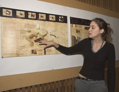
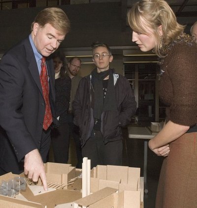
The concepts went public Dec. 7, when the designers — most in their last stage before the master’s degree — gathered in Gould Hall to explain their models and drawings to a crowd that included Ihrig and an attentive President Mark Emmert.
The first-prize winner, as determined by a jury of design professionals, was Michal Russo. She lays out an elegant grid pattern of flagstones lit from below that help define the square as a “middle ground” for students rushing by on their path toward maturity and knowledge.
“… this middle ground becomes the role of the University,” Russo wrote in her statement to the jury. “Precisely at that moment between adolescence and adulthood, between remembering and forgetting, between the protest and the silence, lies the opportunity for change.”
Occasional ground fissures punctuate her plaza and, as a side benefit, help guide the way for people navigating the 1,000-space parking lot below.
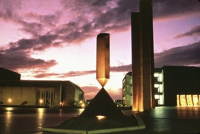
One of Russo’s suggestions, however, drew puzzled looks at the presentation. Intended to symbolize time’s passage as generations of students attend the UW and move on, it is a 50-foot-tall spire that would gradually descend, over the years, into the parking garage below.
Only Emmert ventured to verbalize a question about this descending tower — a question that broached a subject which can be touchy on almost any college campus:
“Whose parking space will be underneath that thing?”
* * *
Models and drawings of the Red Square proposals are on display at the exhibit space inside the west entrance of Suzzallo Library.
The work by the College of Architecture and Urban Planning students was judged by a professional jury of Cath Brunner, executive director of 4Culture; Gareth Loveridge, an associate with GGN; and Daniel Mihalyo, a partner with Lead Pencil Studio.
Prizes were awarded to:
- First: Michal Russo. “Finding a Middle Ground.”
- Second: Eric Higbee. “Guiding Lights: Navigating Landscapes.”
- Third: Makie Suzuki. “Trans / Form.”
- Honorable mention: Alison Maitland.


